Showing posts with label fall. Show all posts

Thursday, October 28, 2010

Color Club Bewitching Halloween Mini Set 2010

Sorry about the lack of posting and online involvement, guys. Still not quite feeling like myself. Luckily my annual vacation is in a couple weeks so hopefully I'll feel better after that!

Anyway, wanted to be sure I posted this while it was still relevant. Only a couple more days til Halloween! Not enough time to order online and get it in time, but they sell these sets at Meijer now, so you can finally get Color Club sets in store in certain areas.

This is a set of four minis plus a roll of adorable Halloween nail decals (I seem to have misplaced my photo of them somehow) plus a little wheel of nail art gems/beads/decorations in black and orange that are sold separately. They're on the display next to each other.

And one more note before the pictures- these all seem like they might be re-promoted colors. I didn't side-by-side compare any of them but they're all really familiar.


Bewitching. Standard black creme.


Charmed, I'm Sure. Really inaccurate pics. This is purple, not blue. It's a lot like OPI Ink, and this might be Color Club Electronica, but my Electronica is a lot more sparkly. See the duochrome reflection in the bottom of the bottle in the sunlight pic? Much closer to the 'real' color of this polish.


Hocus Pocus. Man, blurry pics of holo polishes and glitter always look so good! Kinda gives you an idea of how sparkly it is in real life. Anyway, this is an absolutely gorgeous pale silver plus pink/lavender subtle tint hologram glitter. Could be Magic Attraction but this one seems warmer.


Spellbound. Traffic cone orange neon creme. Excellent color. Probably matches up to one of Color Club's existing neon oranges. Love this shade of orange though, it's absurdly bright.


These are minis but they're actually a pretty good size- .25 fluid ounces- that's half a normal polish bottle. No .13 fl oz mini-minis here. Great formula. I did three coats of all, none of them needed the third except Hocus Pocus but I was curious to see how they looked with three anyway.

I always dream about going to a Halloween party where they give out mini Halloween nail polish sets - like this or OPI Go Goth - in the gift bags... How cool of a party would that be?! Maybe I should host one.

(These were sent to me for review.)

Thursday, October 7, 2010

New Kiss Halloween Nail Decals and some of my decal collection


Since Halloween is coming up quickly I've been scouring the stores for some new Halloween-themed nail stuff (and makeup and housewares and so on...) and came across these in Walgreens:

(Click to enlarge)

Aren't those CUTE?! They are two separate sets- the left purple/black background is set one and the right orange/yellow background is set two. The left ones seem like a variation on my favorite Fing'rs EDGE decals with the skulls and bats (of which I may or may not have about 20 packages stockpiled...) and the ones on the right don't remind me of any existing set of decals.

I adore these. There's only one thing I don't like about them. See how on the set on the right there are words? "Witch" "pumpkin" "skull" and whatnot? That's really lame. Boo is cute, Happy Halloween and Trick or Treat are cute, but honestly, how dumb is it to have the word 'skull' written on your nails? It's not a picture of a skull... It just says 'skull.' Uh.... Did they need page filler or something? Why not throw on a few more pictures of bats or actual skulls?

And just for fun, I took a picture of some of my Halloween decal stash (I am obsessed with decals)

The new Kiss ones are on the top left so you can see how they're packaged. Last year's Kiss ones (in the middle) were really cute. I don't know if you can see it but there's a pumpkin with a witch hat that's just adorable. There's also some bones in one set that look like dog bones that I've used with the Fing'rs paw print decals.

Are there any Halloween decals I'm missing? I need to collect them all!

Wednesday, September 29, 2010

OPI Here Today Aragon Tomorrow Suede Fall 2010

OPI's converted another one of their shades into a matte-finish Suede polish. This time it's the dark blackened green from last Fall's Spain collection called Here Today, Aragon Tomorrow.


Here Today, Aragon Tomorrow Suede. Why do I always stick my finger in the polish and ruin it?! It seems like it always happens on the best colors, too. Sorry about the big lumpy smudge on my ring finger. Anyway, this is a rich emerald green matte that's jam-packed with tons of foily silver shimmer. As you can see, it looks absolutely nothing like the original Here Today, Aragon Tomorrow:

OPI Here Today, Aragon Tomorrow (La Coleccion de EspaƱa, Fall 2009)

Seems to be a common theme among OPI's suede polishes- looking pretty much nothing like their namesake.

The finish is the full-on no shine chalky matte that I adore and it seems to stay matte much longer than I'm used to. Doesn't get shiny by the end of the day. It dries super fast. It does not wear as long as normal polish because it is a matte, but I got three days with no chips when I used this with Gelous basecoat.

If you thought it was beautiful with its natural matte finish, wait until you see this:


OPI Here Today, Aragon Tomorrow Suede with one coat of Seche Vite Topcoat. I can't handle all this awesome. Can you believe this?? It's the most ridiculously sparkly luminous evergreen shade ever when you add topcoat. It sparkles more than most glitter polishes and there's not even any glitter in this! Must be because of all those little foil particles that OPI uses in their suede polishes. It's good matte, but it's AMAZING with topcoat.

The formula was great. Totally smooth, not too thick, didn't dry too fast. Use enough polish on the brush when you apply and you won't have any problems. I did two coats here. Dry time is super fast. Wear isn't great, but it is good for a matte, I got three days before it chipped with the basecoat I used.

You know what I like about this color? It reminds me of these Christmas ornaments I have. They come in frosted forest green and deep burgundy red. I hung them from the chandelier last year instead of putting them on the tree and they looked really pretty. I love Christmas, so anything that reminds me of it becomes a favorite of mine. Hell, I love every holiday so anything that reminds me of any holiday gets high praise from me. Especially if it sparkles!

(This was sent to me for review.)

Finger Paints Breast Cancer Awareness Shades 2010


October is Breast Cancer Awareness Month, and Sally Beauty's Finger Paints brand has released two pink shades to help raise awareness:

I'm A Survivor. This is a deep candy pink with large silver shimmer flecks.

And...

I Pink I Can. This one is a pale baby pink with a very fine silvery shimmer.


None of the proceeds from the sale of the individual polishes will be donated, but Sally Beauty will be making a $65,000 donation to Cancer Support Community in October.

These will be available at Sally Beauty starting October 1st and they retail for $4.99 each.

(These were sent to me for review.)

Monday, September 27, 2010

China Glaze Rodeo Diva Fall 2008 Revisited

This collection was released in 2008 but to this day, even after the dozens of new collections that have been released since then, China Glaze's Rodeo Diva remains one of my favorite collections of all time. This is what a fall collection should look like.

When I posted my swatches two years ago I was so excited about these colors that I rushed and posted pretty crappy pictures. I just couldn't wait, I was so thrilled that I had to post them immediately! But the lighting was bad, my application was shaky and I had some broken nails. So, I figured it was about time I try to do these amazing polishes justice.

Here they are once again, the incredible China Glaze Rodeo Diva polishes.


Branding Iron. A deep blackened red shimmer. One of my favorite kinds of colors! See how it looks dark on the edges and light in the middle? I can't get enough of those colors.


Cowgirl Up. Amazing red-purple shimmer. Possibly in frost territory? The shimmer is really fine like a frost but this is just too pretty and smooth to be a true streaky-silvery frost. This shade looks really amazing in the sunlight, it has hidden iridescent shimmer!


Golden Spurs. A warm light suede brown base with gold shimmer. This one doesn't look that great on me but I still love the color. So much pretty gold shimmer!


Gussied Up Green. I remember this being my favorite one when I first got this collection, but now I can't pick a favorite. This is a blackened blue-leaning green shimmer. Very dark but when the sunlight hits it it really sparkles.


Lasso My Heart. A mauve purple foil. Not as dense or silver-toned like most foils, this one is pure color and very smooth.


Midnight Ride. Extremely dark purple shimmer. Dark and dramatic. Looks mostly black indoors but in the sunlight you get glints of glorious purple.


Prize-Winning Mare. Similar to Golden Spurs in concept- a light brown base with gold shimmer. This one is much more shiny and metallic, though, and not as warm. The overall effect of this one is actually more of a bronze foil metallic look than just a plain shimmer.


Red Stallion. This color never photographs right for me! It's so metallic and shiny that my camera freaks out. It's a bright metallic red, very glowy, almost radioactive.


Rodeo Fanatic. Medium blue shimmer. Seems to be a tiny bit on the teal side- doesn't look like straight pure blue to me. Maybe there's a touch of green in the formula?


Side Saddle. The base of Side Saddle is a dark brown-toned plum shade. Raisin perhaps? Brown and purple, a bit like Lancome Lizzie Jagger. The shimmer in this is very shiny light gold.


Wagon Trail. What a cool color. It's a black base with gold shimmer but it combines on the nail to look like a olive green. Looks amazing in the sunlight.


Yee-Haw! Orangey, coral-ish pink and gold shimmer. Quite warm. Has an almost duochrome look to is because the pink-coral-peach base and the gold shimmer are each so strong that you see more gold where the light hits it and more pink where the light is indirect.


This was during the area where China Glaze's formula was on the iffy side. Runny, drippy yet thick. Remember those days? The formula on these was actually not bad, but not the easiest to control. I did three coats in all these pictures. Drying time is on the long side for some colors but not for all of them.

Still love this collection... Still get excited about it every time I see the colors. Not very many polish collections have that sort of effect on me!

I don't think any of these colors are particularly hard to find even though they're a few years old. I wonder if any of them have been made permanent? I'll have to find out!

Friday, September 24, 2010

NARS: Old Zulu versus New Zulu

You know... I don't know if I've ever reviewed Zulu all by itself! I suppose that will have to wait until I'm done with this post!

As you all may know by now, NARS has listened to all of us begging them to bring back the beloved green polish and has re-released Zulu along with a few others that were discontinued around the same time (like Mash and Midnight Express).

My first thought when I heard that was "WOOHOO!", but my second thought was "Oh no, I hope it's still the same."

So, I grabbed my original bottle of Zulu and compared:

With flash
Left: Original Zulu, three coats
Right: New Zulu, three coats


Different angle. You can see a bit of a difference in the bottle color.


Left: New Zulu
Right: Old Zulu


Flash shows a slight shade difference.
Left: New Zulu
Right: Old Zulu

The question is, "are they different?" Yes and no. For one, the new version has received a formula update and is more opaque and less streaky than the original. But, color-wise, I detect a small deviation from the original color. It's most apparent on the first coat, but the original is a more saturated color and has a touch more blue. You can see in the bottles that the original looks slightly richer and more jelly-like. The new one isn't quite as jelly-like or as rich of a green.

Is it totally different? No. They're nearly spot on with only minor differences. And, unless you're like me and can see the difference between nail polishes that seem identical to 'normal' people, you probably won't even notice a difference. Especially not at three coats.

And just for fun, here's a really old picture of me wearing the original Zulu, two coats I believe:

You can really see the rich green base color here. At three coats it's near-black, which I love, but at two it's quite green. And yes, a bit streaky, but if you're careful and don't rush (like me, I rush, patience? What's that?) you can get a smooth even coat each time.


Very happy to see one of my favorite colors of all time return. I know everyone's been looking forward to this, myself included. And it still amazes me how almost no company has been able to duplicate this color. I've seen two that are close, but one is already discontinued and very hard to find. I supposed that's irrelevant now that it's actually back!

(The new Zulu was sent to me for review.)

Wednesday, September 22, 2010

Illamasqua Art of Darkness nail polish for Winter 2010

Two more dark shades from Illamasqua. Thankfully, I like these much better this time, no disappointment here!


Scarab. My favorite of the two. A rich, velvety red shimmer. This is not just plain red- it's a little brown toned and has some gold in it. It's one of those dark on the edges/light in the middle glowing 'lit from within' shades that I love so much, like OPI Royal Rajah Ruby. It has some really awesome looking gold duochrome in the bottle but it's not really visible on the nail. Oh, and it's a one-coater. I did two here just because. I like everything better with more coats anyway.


Viridian. A deep blue-green shimmer. People were telling me this was frosty... I don't see frosty here... I see shimmer. I am relieved. Not brushstroke-y, not dusty looking, just a nice green shimmer. Gorgeous gem-like shade, but I feel like I've seen it before... It strikes me as being similar to Nubar Earth or something in that blue-green shimmer category. Makes me think of Christmas ornaments, both these colors together. Cute!

The formula on these was excellent in true Illamasqua tradition. Super opaque, I did two coats in these pictures but I really only needed one. Smooth, even, not runny or too thick, just all around good. Drying time is average, nothing worth noting. Dries to a dull finish, but that's sort of irrelevant cause topcoat instantly removes that... just thought I'd mention it, though.

I like these. Scarab came in a cool box with an over-sleeve with a picture of a Scarab beetle on it and some spooky butterflies on the side. It was a nice touch, unfortunately I forgot to photograph it once I saw the polish inside! I usually love polishes with names that remind me of things, but these polish names make me totally geek out.


* is dork *

(These were sent to me for review.)

Thursday, September 16, 2010

Orly Cosmic FX Collection Fall 2010

I posted the comparisons a while back, but now I'm finally ready to post the whole collection. Took me a while to get some good pictures of Space Cadet! Still not perfect, but better than my first try.

Remember how much we all freaked out over the press release? They're different than I expected but they were in no way a let down for me- I freaking love this collection.


Galaxy Girl. This one was so hard to capture but so beautiful in real life. It's a red-brown base with dominant teal blue flash which comes from these lovely glass-gleck like metallic particles and it has a complimentary dark pink flash at a different angle. There's even a little bit of purple and gold visible at certain angles. It's dark, which is awesome, dark duochromes are some of my favorite duochromes! And no frost! Yay!

Halley's Comet. On a side note, my bottle of this reads "Halle's Comet" like Halle Berry but the name of this according to Orly is Halley's Comet... confusing but kinda funny! Anyway, if you've seen Zoya Charla or OPI Catch Me In Your Net, you've seen this. It has more green to it in real life but my camera likes to pull out the blue in it. Blue/turquoise foily glittery green duochrome mermaid polish. Totally gorgeous, would definitely recommend getting this if you don't already have the Zoya or OPI.


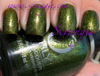
It's Not Rocket Science. It's Rocket Surgery. Hehe. But seriously... super beautiful polish. Murky warm green with gold and yellow and blue sparkle and slight duochrome with a swampy green sheer base. Strange description but the end result is fantastic! Also, this is the most opaque of the recently-released similar colors and has more blue tone to it than the others.


Lunar Eclipse. Extremely pretty rich blue sparkle with purple duochrome. Like Halley's Comet it is not unique, but despite being duplicated it's still gorgeous.

Out Of This World. Are you drowning or waving? I just want you to save me... Should we try to get along? Just try to get along... A vampy blue-toned purple with glittery gold duochrome. Similar to Zoya Julieanne. Like the rest of the shades, I have nothing negative to say about this color, it's amazing even if it isn't unique.

Saved the best for last....


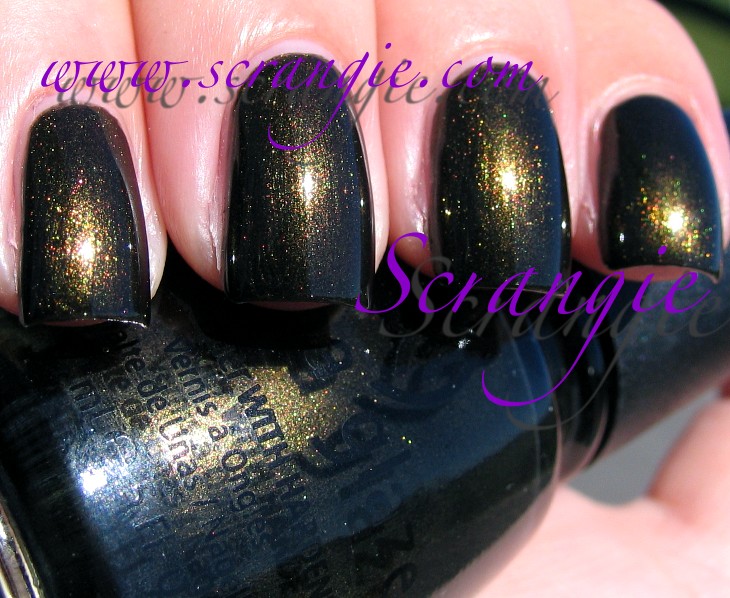
Space Cadet. I tried so many angles and so many different types of lighting to try to capture the awesomeness that is Space Cadet but I still feel like I failed to convey just how freakin' sweet this polish is. It's a glittery, sparkly, foily duochrome... And when I say 'duochrome' I really mean 'multichrome'... bad habit. But I don't feel like always counting how many colors they flash! This one is a purple base with dominant golden green duochrome. It has pink, it has orange, it has green and gold and yellow, it has purple and even a little blue. It's practially a rainbow of duochrome sparkle. Truly magnificent. I can't rave enough about this color, this is one of the best shades I've seen in my life and it's already made it into my favorite polishes of all time list. You have to see this in person to really enjoy how much it switches between colors.

The formula on these was great. I'll admit I didn't have high hopes for it, but it exceeded my expectations. They're all opaque- three coats of each in these pictures-, they dry much more quickly than I'm used to for Orly and they went on pretty smoothly. Only a little runny. Other than that they were perfect. Not super three-free textured like I thought they might be.

One of the best collections ever. I know a lot of people were disappointed that some of the colors are duplicates of other colors, but the way I see it... If you look at this as a whole collection, by itself, without comparing it to what's already been released, it's perfection. The only way I could improve on this collection would be to make six more shades like this. So in that sense, I'm not disappointed. But, since we are all polish junkies and we do follow the latest releases like hungry vultures, we have already seen some of these colors. It would be nice if every shade was completely unique, but the collection as a whole is undeniably awesome.

I do have one complaint about the collection and it has nothing to do with the colors. It's the price. Orly raised the price of this collection to $10 per polish. Do I think they're worth the price? Yes and no. Yes because I've paid more than that for polishes not even half as cool. No because the other companies who released the exact same pigment type/polish type didn't raise the prices and they're just as good. $10 is not very expensive when it comes to polish, but it is a little shocking to see from Orly which has traditionally been one of the lower-priced of the salon brands.

We're seeing so much of this new glittery pigment lately. I wish they'd do more with it! It has the potential to make some really great colors from what I've seen in these. Get to work, polish companies! Don't just make redundant shades!

(These were sent to me for review.)