This is the collection we've all been waiting for.... And now that I've swatched it, it hasn't let me down! It is glitter heavy and super sparkly, exactly what I was hoping for.
These are too pretty to capture in just one photo so I tried to take more pictures to show every detail. Still, they're much nicer in real life- hard to show just how shiny and pretty glitter look in photographs!
As always, I encourage you to click the images to enlarge and view in detail. Enough talk, on to the sparkles!


Ali's Big Break. One of the hardest to capture colors in the collection. It's a red, medium depth, cool toned, sort of pink looking actually, but instead of being plain and boring, it's packed with tons of iridescent and gold broken flakes. You can see the flakes really well in the right side of the bottle in the indoor picture. See how cool they look?


Bring on the Bling! This polish shows a lot of different tones depending on the lighting. In bright light it's almost beige and green but in soft lighting or at night it looks more warm and golden. This is a glitter made up of mostly light gold, but also has particles of varying sizes in shades of blue, red, orange and pink.


Extra-Va-Vaganza. First, I just have to say, what on earth does this name even mean? It's bizarre. Every time I've typed it I have to double check... It always looks like I've typed something else, if you know what I mean! Moving on! This is about 50/50 orange and gold glitter. The color scheme reminds me a lot of China Glaze Spellbound, but I don't think there's any silver in this one. It sure looks silvery in the sunlight, though. I think I also see some pink and maybe a couple blue particles in there, but I can only catch glimmers of them every now and then.


Glow Up Already! In sunlight this does look a bit like Bring on The Bling, but it's more similar in theme to Rescue Beauty Lounge Locavore. Not a duplicate, but it has a lot of the same colors of glitter. The main color seems to be a light green and there's also quite a bit of gold. There's orange and blue and even a little purple.


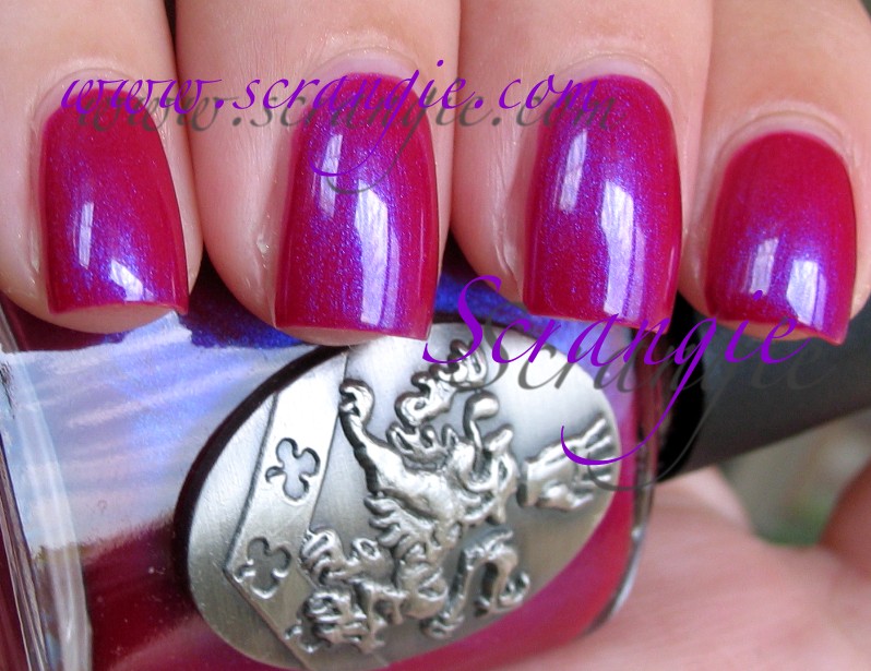
Let Me Entertain You! Okay, now this color REALLY didn't photograph right. It is very washed out- in real life it's a lot darker- it's a dark magenta and not a light red like it looks here. I do think these pictures show the different colors of sparkle pretty well, though. It reminds me very much of Zoya Alegra, which also doesn't photograph well. So, dark magenta pink, glass fleck and nearly foil shimmer with violet, gold and hot pink colors flashing throughout.


Rising Star. Isn't this pretty? It's a really warm orangey gold. Gold with copper? It has a really nice metallic glass-flecky sparkly finish, too. A little bit like those metal Milani ones, but much nicer. Smooth, opaque. Very rich and flashy looking.


Show It And Glow It! Mainly purple and silver glitter. Some of the particles are super fine microglitter and some are larger 'normal' glitter, the combination ends up being extra sparkly because of that. Like the other glitters, there's some other colors mixed in in smaller amounts- I can see orange and blue- just not a whole lot of it. Interesting to note, my bottle settled weird and I had all purple glitter the first time and then all silver glitter after that, then I shook it really well and it came out like this! Whichever way it applies for you it's going to be beautiful, plus it layers really well.


Simmer and Shimmer. Awe, it's Absolutely Alice's baby sister! It's not much like Absolutely Alice other than the blue and gold combination, though. This is a much lighter blue with lots of silver, gold, red/pink and orange glitter mixed in. It's not as rich and bright as Alice but this one has more of a festive party confetti appearance.


Sparkle-iscious. I think this might be my favorite of the glitters in Burlesque. It's so colorful and happy looking, it makes me smile to look at it. It has yellow/gold, pink/purple and blue. It reminds me slightly of something like Finger Paints Wicked Glitter with how colorful it is. It also reminds me a little of craft glitter... yes, I said it, craft glitter. Makes me want to get some Elmer's Glue, popsicle sticks and construction paper! Not to say it looks kindergarten-ish, but it does give me happy memories of arts and crafts. Maybe that's why I like it so much. Very wearable, though, and great for layering as well.


Take The Stage. Glorious reddish copper. Such a fall colored polish! It's fantastic! Really smooth metallic finish, NOT FROST! Yay! Has that kinda glass-flecky pearly shimmer too, but really fine and smooth and even like Rising Star. Brings back flashbacks of one of my old favorite OPI shades- Music Hall Curtain Call. Not a dupe, just reminds me of it.


Tease-y Does It! At first I thought this might look like Zoya Valerie, but once I put it on my nails I was totally wrong. Someone mentioned to me that it looked like Nubar Raspberry Truffle and it does look quite a bit like that one. It's a purple-brown base with very duochromey red and gold glass fleck shimmer. Red/pink is the dominant color of the shimmer but it turns gold at an angle. In the bottle you can see a little green, too. This has a dusty faded look to it.


The Show Must Go On. This one is a deep pink, perhaps more of a coral than a pink, and it has gold duochrome. I tried to capture as much of the duochrome as I could- can you tell it's there? It's pretty evident in real life. This has the same glass-fleck like metallic large particles of shimmer as the rest of the polishes and it makes for a really sparkly looking polish. This has been tossed around as a dupe for MAC Bad Fairy but it doesn't look like one to me. I haven't swatched them side by side yet, but Bad Fairy looks really different.
Since these glitters are so nice for layering, I thought I'd show you a couple examples of what they look like layered:


Left to right, all one coat of OPI over one coat of Illamasqua Boosh with Seche Vite
Index: Show It and Glow It!
Middle: Extra-Va-Vaganza
Ring: Bring On The Bling!
Pinkie: Sparkle-iscious
They look really great over black. One coat is perfect. They're pretty dense so you can wear them alone without doing a million coats so I thought they would be too dense for layering, but no, they're just right at one coat.


One coat of glitter over two coats of base color with Seche Vite
Left to Right
Pinkie: Sparkle-iscious over The Show Must Go On
Ring: Show It And Glow It over Let Me Entertain You
Middle: Bring On The Bling over Rising Star
Index: Extra-Va-Vaganza over Take The Stage
Looks pretty fantastic layered over the other colors in the collection, too. It amps up the sparkle to an insane amount and the colors all mesh well with each other. Layering also keeps them smoother, less glitter on the nail.
The formula on these was excellent. Very smooth, even, good pigmentation and glitter concentration. This is three coats of all plus one coat of topcoat. You'll want a good thick topcoat for the glitters as they tend to be quite bumpy/textured when they dry. Great drying time- three coats dried really quickly. No defective brushes in my batch, either. The removal of the glitter isn't exactly a picnic, but isn't much trouble with the foil method or one of those scrubby jars.
I'm ecstatic about this collection. OPI really knows how to do glitter. They don't do it often, which is a crying shame, but when they do I know I'm going to love it. Remember Absolutely Alice and Mad As A Hatter? I'm convinced they either saw how much everyone loved them and wanted to sell more, or at least saw how much people have been buying glitter the past few years. Whichever it was, or even if it wasn't like that at all, I'm glad they made these. I am a glitter fiend. These are so shiny and sparkly you'll have to see them in real life to get the full effect.
The non-glitter shades are great as well, all of them are very sparkly without being glittery. This is a very 'happy' looking collection. Lots of bright, gleaming metallic holiday colors and lots of sparkle. Makes winter seem not so bad. Not that they're strictly winter or holiday colors, all of these could fit perfectly into any season. And who cares what season they're meant for, anyway? They're hot, I plan on wearing these all year!
Also.... Thank you, OPI, for not doing the horrible frosty trend that seems to be plaguing polish collections this time of year. *whew* What a relief.
Thought I should mention that these are supposed to tie in with the movie Burlesque (with Cher!) that's releasing later this year. I probably won't see the film but I do rather like Cher, so that's cool.
These are available now at some beauty stores and online, but I don't know what the official release date was/is/is supposed to be... I'm still scratching my head on that.
(These were sent to me for review.)

 Citrus. Really pretty hot pink / pinky coral with gorgeous gold flash/shimmer. I like the gold shimmer in this a lot, reminds me a little of OPI Bright Lights, Big Color- only a pinker, more demure version.
 Debutante. A pale pinky-champagne with really strong gold duochrome. I'm digging the duochrome nature of this even if it is a really soft color. It's both flashy and subtle.
 Poseidon. Aqua blue creme. A little softer than something like Zoya Robin. Not quite as bright and clear as the standard sky/aqua creme.
 Sugar Plums. This one is a hot dark magenta with a blue/violet duochrome flash/shimmer. The shimmer sits on top and changes colors when you move your hand.
 Talon. Dark navy shimmer. Not unique but it's still pretty.
 Wine and Dine. I wanna date you, baby... I wanna take you out... I wanna wine and dine you... Sorry, polish names always remind me of songs. This one looks cooler in the bottle than it does on the nail, but that's not to say it's bad on the nail. In the bottle it looks like a magical swirl of pink and silver glitter but on the nail it becomes a light pink foil. Foils are pretty cool, but I was hoping for more glitter based on the bottle!


